Riven Mouthwash

Riven
Mouthwash
VISUAL IDENTITY
PACKAGING
In the world of wellness, oral health is often overlooked. Riven began with a simple question between longtime friends Fatima (the dentist) and Jay (the entrepreneur); why hasn't anyone tried a different approach? Instead of the traditional method of stripping away bacteria to sterilize your mouth, destroying balance to your oral biome, why not reinforce the good bacteria that’s already there? A seemingly simple concept, yet nowhere to be found. So, they built it themselves and launched in 2021.
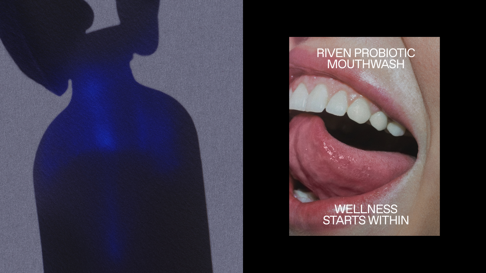
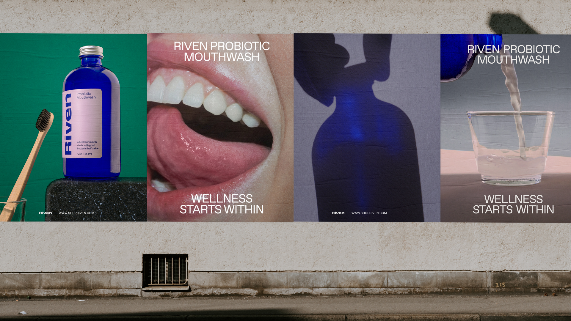
Riven believes that a happier mouth starts with a strong biome. That when we nurture our body, we nurture our soul. Their range of products enhance your oral ecosystem so that it can work the way it was meant to—in harmony. The visual identity system was created to embody these scientific and caring qualities. Art direction and glowy photography style was inspired by all the wonderful goodness and energy inside of us. Wellness starts within.
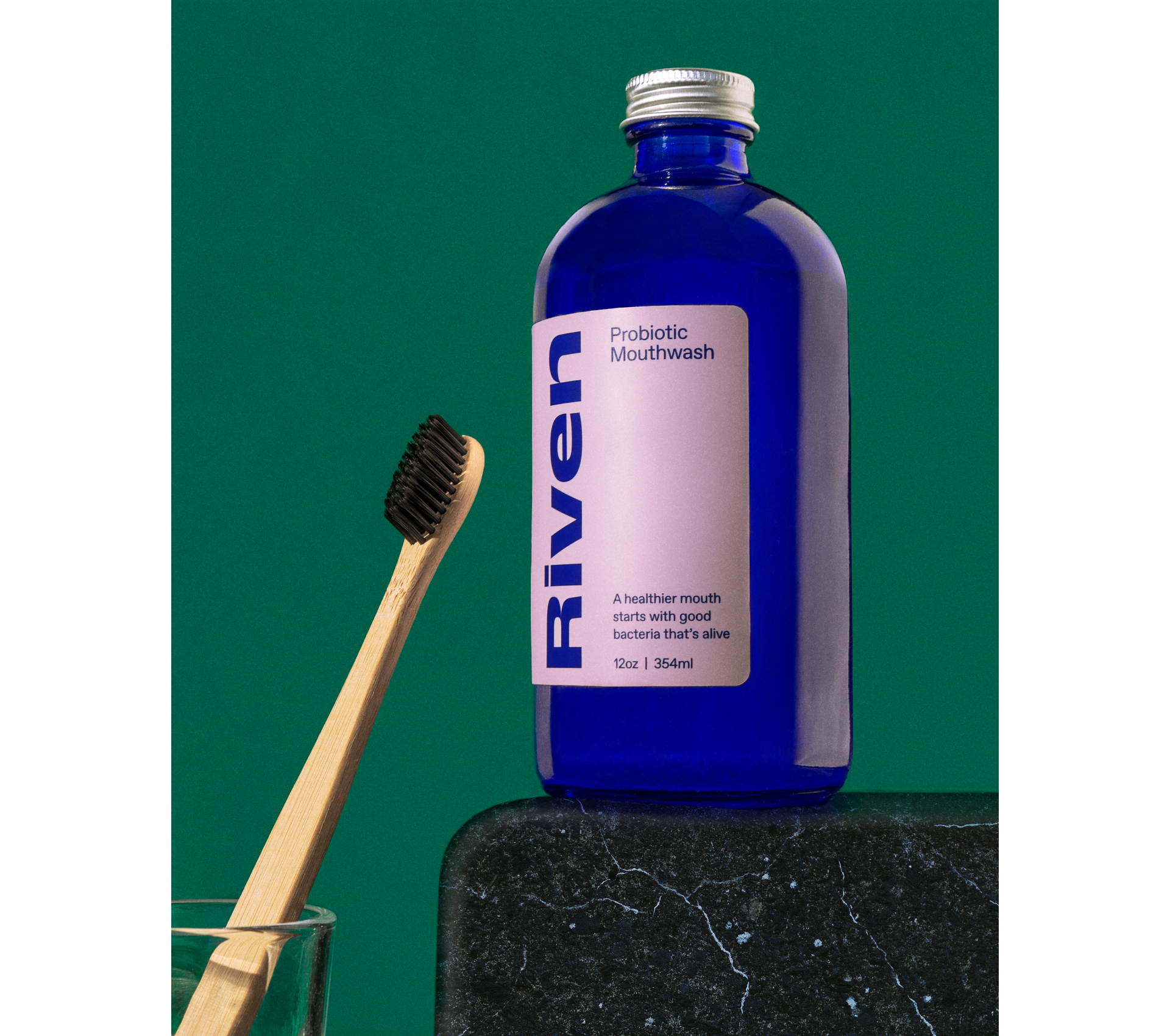
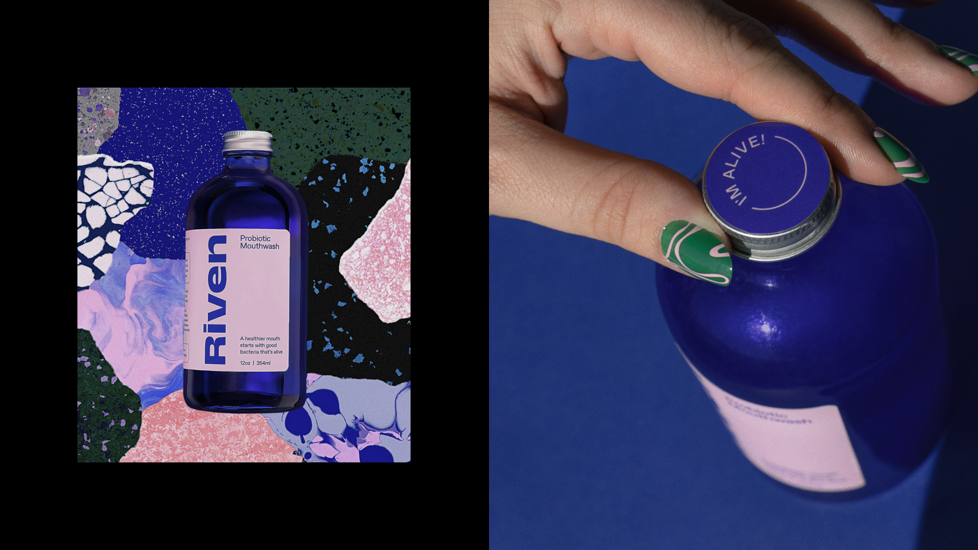
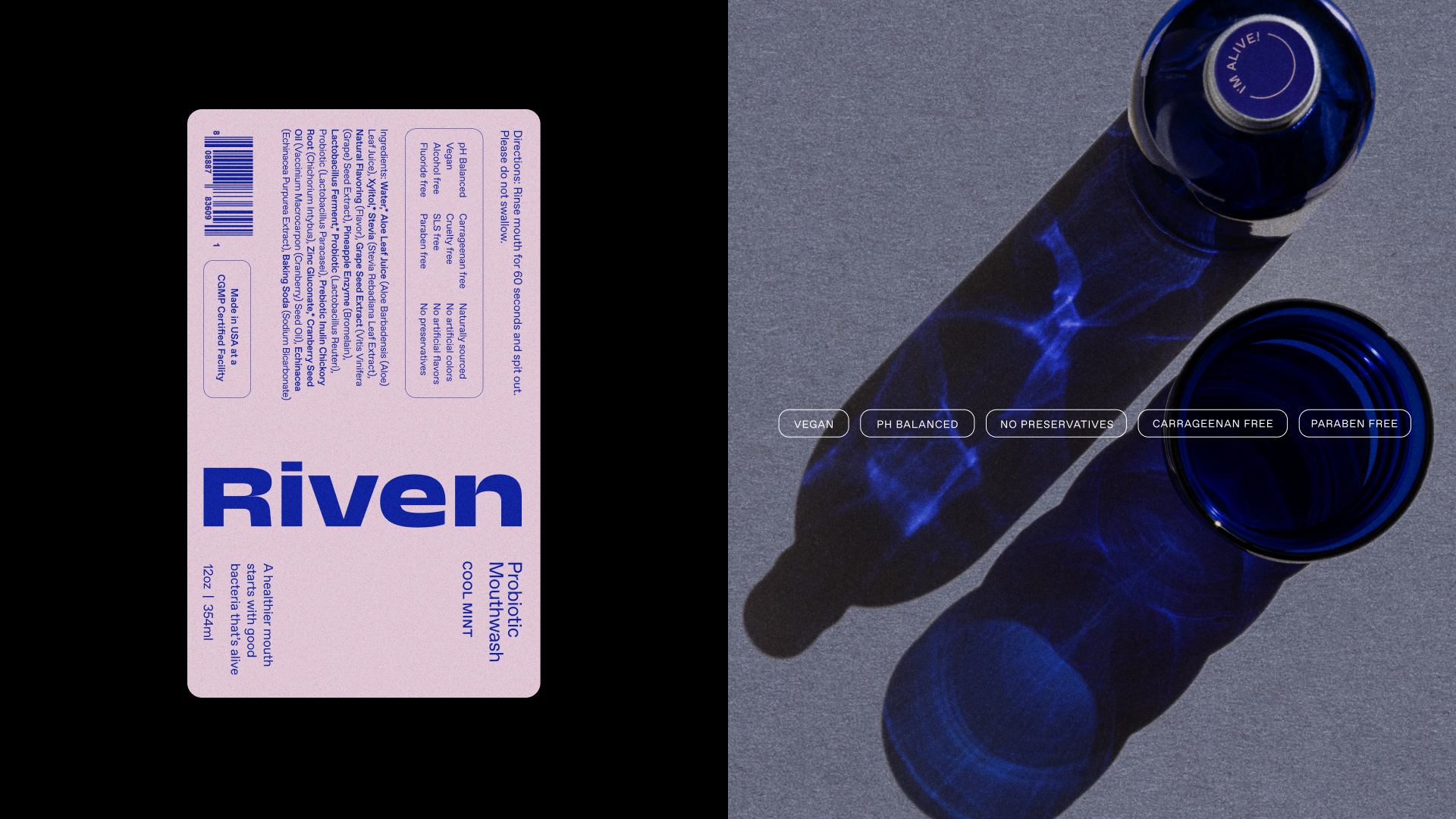
In a category where stark packaging dominates the shelf, we chose a bold blue reusable glass bottle to disrupt. We wanted to bring the thoughtfulness and design sensibilities from the overall wellness space into the oral care category.
CREDITS
Visual Identity, Packaging, Still Life Photography: Studio Badal Patel
Strategy: Green Room Creative

